

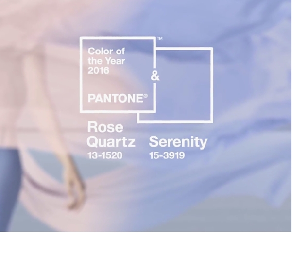
The Pantone Institute has announced the color of the year for 2016 — and surprise! — it’s actually not one color, but two.
Looks like Rose Quartz and Serenity will reign as the duel colors of the year. The calming, soft colors were selected to “demonstrate an inherent balance between a warmer embracing rose tone and the cooler tranquil blue, reflecting connection and wellness as well as a soothing sense of order and peace,” Pantone Executive Director Lee Eiseman said.
This is the first time that the Pantone Institute, a color predictor and trend forecaster, has crowned two shades as the color of the year.
“Rose Quartz is a persuasive yet gentle tone that conveys compassion and a sense of composure,” Eiseman explained. “Serenity is weightless and airy, like the expanse of the blue sky above us, bringing feelings of respite and relaxation even in turbulent times.”

We think these colors will be great for decorating outdoor spaces. The luxurious cool blue and creamy blush pink shades bring a sense of relaxation and softness, and isn’t that the kind of atmosphere we’d all like to cultivate in our outdoor living room?
The 2016 color selections remind us of Skyline Design’s Brafta and Lyon Outdoor Seating Collections.

Let us know what you think about the 2016 Color(s) of the Year!

One thought on “2016 Color of the Year”